PT Solutions Logo Sting
PT Solutions Logo Sting
January 30th, 2019
Project Background
Year after year PT Solutions is recognized by Forbes as one of the fastest growing companies in the US. They are an exceptional physical therapy practice dedicated to helping their patients heal and be their best everyday. It was time for some iconic new branding assets that could represent the amazing work they do, starting with a shiny new logo animation.
The logo needed to not only work as a sting at the beginning or end of videos and other high-impact presentations, but also seamlessly loop for large and small displays at events. Most of all, it had to look good. ?
Design Process
I started with a mind map to try and get a better understanding of the brand, the industries it inhabits, and the people it serves. Words like “medical”, “intelligent”, and “clean” stood out, but also “athletic”, “exciting”, and “strength.” I knew the design was going to have to walk the line between the traditional, trustworthy healthcare style, and also bring the energy and flash of a brand deeply entrenched in the world of sport.
I also knew from meeting with the client that every part of the logo was integral to its meaning, and I wanted to give a spotlight to the formation or position of each piece.
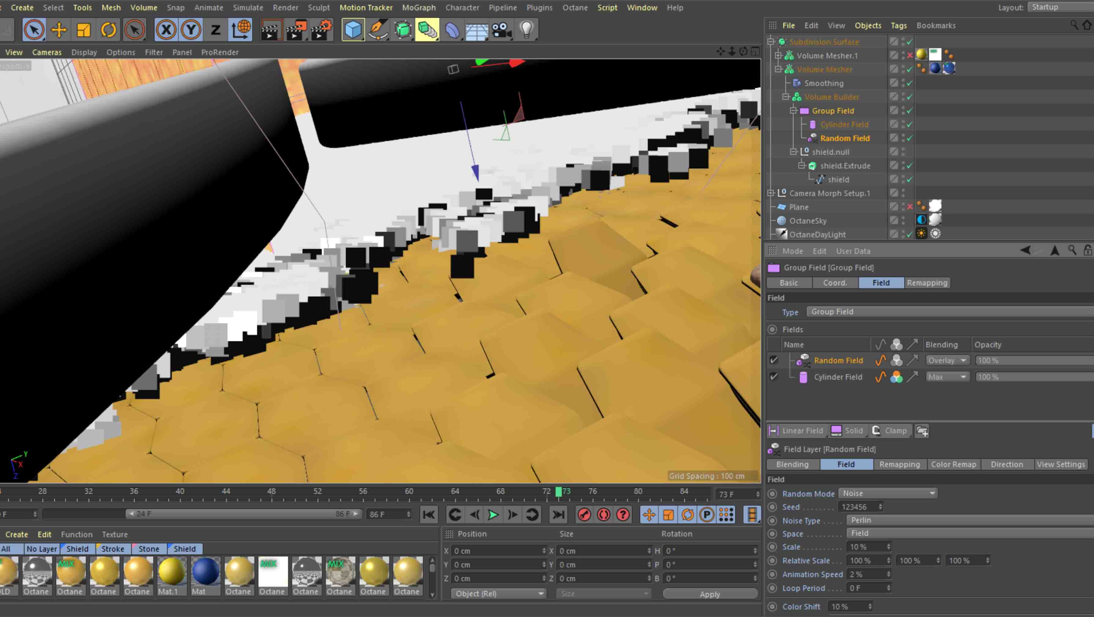
After some sketching and experimenting in Cinema 4D, I came to the concept of the shield activating and setting the other pieces in motion. The logo starts with a very clean, porcelain look (the medical side) and then this energy swells up and transforms it (the athletic side) through whirl of movement and light. The gold and blue materials were modeled after sports car paints.
Animation Process
This was my first client project in Cinema 4D since completing C4D Basecamp, and also my first time ever using Octane Render. As testiment to the effectiveness of School of Motion’s online courses, and EJ Hassenfratz’s gifted teaching, building out the geometry and setting up the animation was fairly easy. I found this video by Andrey Lebrov (all his videos are great resources) was extremely helpful as a rundown of materials in Octane and how node based systems work.
The effect of the liquid-y blue washing over the golden shield clones was made possible without any plugins thanks to the newest release of C4D: R20. I went through a few iterations before creating the final effect based on one of EJ Hassenfratz’s talks at Node Fest last year. In his talk, he explained how fields can be combined to create wipes. Pair that with some noise and you have a cool turbulent growth effect.
Challenges
The biggest hurdles I faced in completing this project were threefold: achieving the appropriate style, software experience, and hardware limitations. As mentioned above, the logo needed to feel balanced between the worlds of medicine and athletics. New to me, though, was the struggle of maintaining brand colors in a 3D environment with changing light sources and atmospheric effects.
Lighting was tricky. The blue shield was theoretically a flat, shiny surface; so, at the right angle, a wrong reflection could wash out the entire thing. I overcame this by first changing the shield geometry slightly– adding height to a new edge in the center to create a surface with two angles. Then each light was carefully shaped and positioned so that highlights and reflections would vary. Each scene was color corrected individually to ensure a match, and the final scene actually fades perfectly into a 2D vector of the logo.
A lack of experience in the software didn’t feel as insurmountable as it should have, considering it was my first project in C4D– but, again, Basecamp well prepared me for troubleshooting and I often looked back at old lessons to jog my memory. When I got stuck, I had a community of designers to reach out to for help. It cost time, but not too much sanity was lost.
Practically speaking, the hardware limitations of my pc were the biggest struggle. My GPU had an extremely low OctaneBench score of 32. I’m used to working economically, however, and just tried to follow EJ’s advice: “check twice, render once.” Many, many super low-res test animations helped me piece everything together before I needed to pay a render farm to put out the final sequences. I used AnimaRender, which was a new process for me, too, but they have an extremely helpful 24/7 support team.
-
- Pre-Compositing
-

- Post-Compositing
Finishing Touches
The compositing was done in After Effects, focusing on color, atmosphere, and lighting effects. I probably could’ve spent another entire week fiddling with different settings and masks in AE. Last but not least, I very much enjoyed putting together the sound design in Adobe Audition. I’m still new to the world of audio engineering, and the client had not requested SFX, so this was a bonus. Most of the SFX came from freesound.org and those creators are credited below.
Credits
Client: PT Solutions Physical Therapy
Design + Animation + Sound Design: Shea Lord
SFX: inspectorJ, wangzhuokun, Waveplay, hykenfreak, PixxelPro, Pro Wave Audio, Sound Ave, Jilted Generation, Rowney Peters
https://www.instagram.com/p/BtZCG5al-KP/